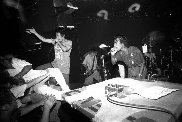
The Los Angeles Times ran a story on Sunday about the new breed of rock poster designers, which I’ve noticed only now, thanks to a link from the essential OMG Posters.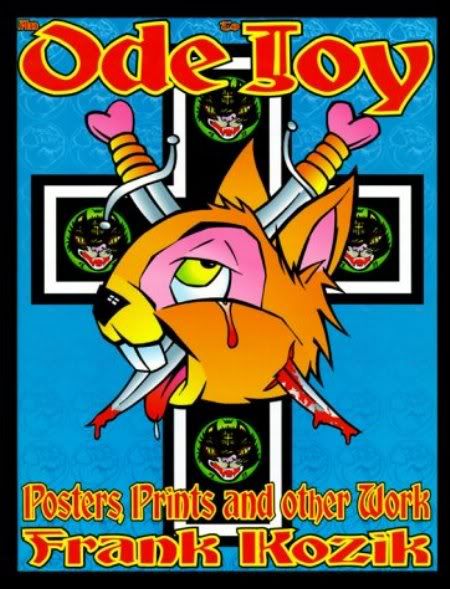 It looks at people like Jason Munn of the Small Stakes and Cole Gerst of option-g, who exemplify the Type B aesthetic of gig-poster art in the ’00s. In the ’90s — when, I would argue, the high-concept retro flyer really took shape — the dominant look was that of Frank Kozik (right): hyper-masculine, perverse, acidic. It’s the look you saw in a zillion posters for the Melvins and Killdozer, etc.
Mutation and anthropomorphism were constants, with babies or women caressing insect-like monsters, or bunnies smiling as they are mutilated. It was an exaggerated cartoon, a rape of the childlike, comic-book style, and it reflected the nihilism and “extreme” attitude of the music.
In the Death Cab age, things are softer, subtler, and more feminine. Adult, not teen; grad student, not dropout. The colors are muted and the designs are cleaner and, as this article insightfully points out, drawn from pre-rock sources. (And, I would add, pre-JD, pre-Wild One, and pre-James Dean — or at least from the Mad Men era, when rock and teen culture existed but as minor, ignorable subcultures.)
The story also pinpoints some common influences:
These artists show a fascination with the iconography of the past, including book jackets, vinyl records, nature icons and modernist design, in a field that has been radically remade by technology: Like today’s vinyl obsessives and neo-craft types, they are post-traditionalists, reveling in, almost fetishizing, print culture after what we’re told is the end of print.
Unlike designers who extend the rock tradition of subversion and boundary pushing, Munn’s work exudes a Zen-like serenity, a love of negative space and an almost religious reverence for typeface. “I try to pick up on little random bits of a band,” said Munn, “and go from there.”
[...]
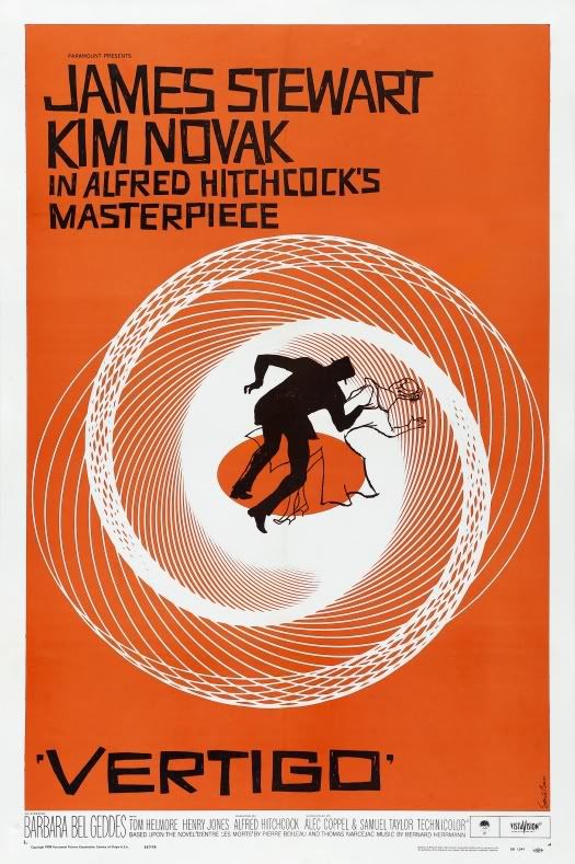
Like his fellow travelers, Munn draws from outside the rock canon. He loves Saul Bass, who designed film posters for “Anatomy of a Murder” and “Vertigo,” and Alex Steinweiss, who invented the album cover in the late ’30s with jackets for boogie-woogie sets and Grieg concertos.

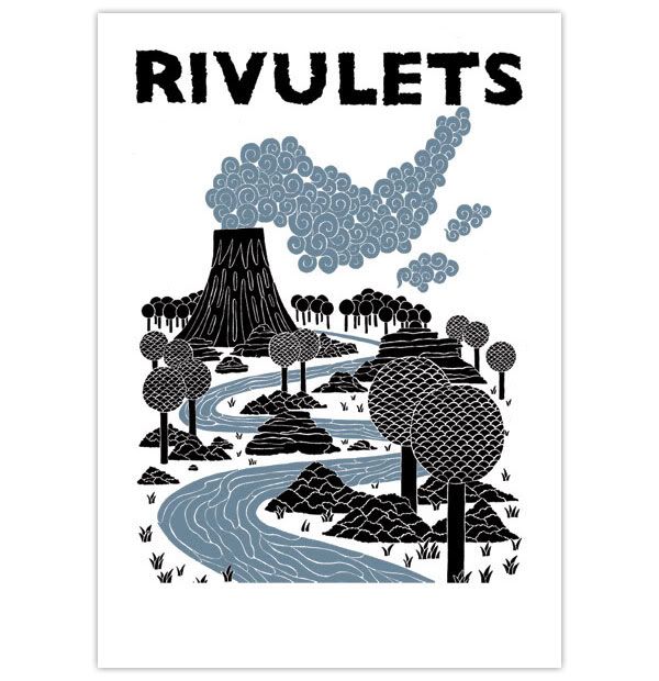
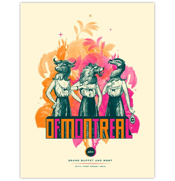
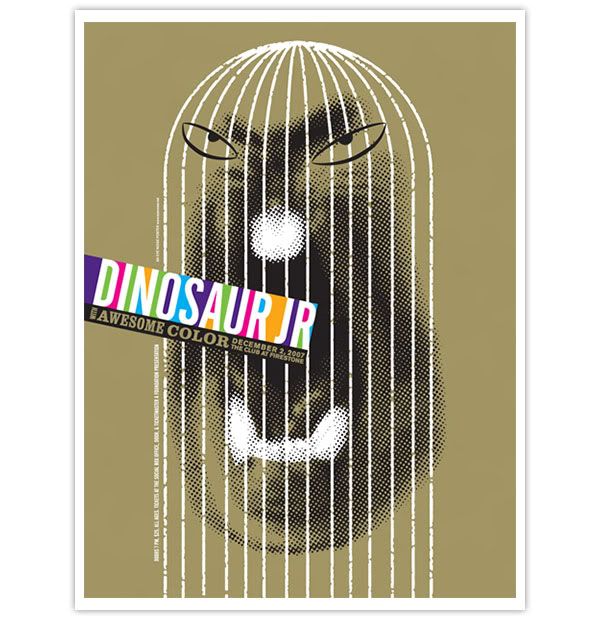
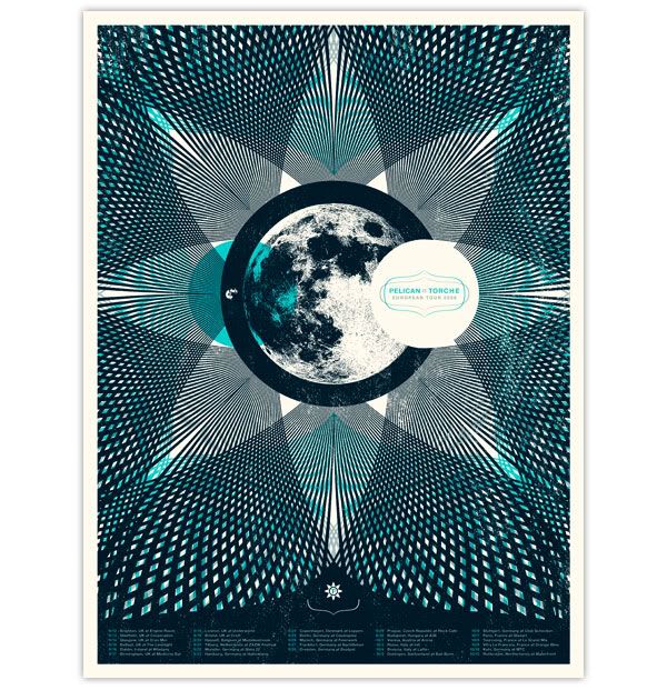
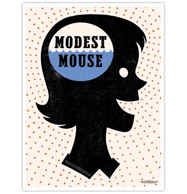
What the article does not address, and what frustrates me a little bit more with every new batch of these posters I come across, is the sense of conformity. The aesthetic described above is almost ubiquitous now, to the point where it’s not always so easy to tell one designer’s work from another. Here are five posters by five different people. (For convenience’s sake I have borrowed them from MBV, which has great taste.)
Is it enough to chalk this up to the idea of a pervading style of our time, a zeitgest? If so, it’s amazing how far the pendulum has swung here, and how it has taken pretty much everyone with it. A decade ago Kozik’s style was very widely imitated, also to the point of excess, and similar trends happen again and again in the history of graphic design. Why are so many illustrators today so blatantly ripping off Chris Ware, for example?
Is it simple professional demand — you do this because this is the stuff that magazine art directors and advertising agencies want and can sell? In that way it would reflect production standards in pop music, which ebb and flow with the tastes and technological developments of a small number of studios and engineers — that’s why so much from the early ’80s has the same drum sound, for example, or why all the post-grunge metal stuff is interchangeable (well, one reason, at least).
But how does this explain the tiny and decentralized world of indie-rock poster design? Theories welcome.

1 comment:
The aesthetics of current indie-rock subculture owe a lot to the movies of Wes Anderson, in my opinion. They also represent the cultured audience that is in indie-rock now, as compared to the the audience in the 1990s. Now, people who visit pitchfork and download music are armchair enthusiasts of graphic design, architecture, industrial design, etc etc. Not to denigrate the indie-rock culture of the 90s, but people who interested in Unsane and Killdozer had interests more in tattoo art, B-movies of the 1950s and 1960s, and nostalgia for skateboard graphic artists like Pushead. I think this is represented by the shift and changes in indie rock poster design.
Post a Comment